featured projects
about me
when i was 8, my dad bought me and my brother a ps2. that console made me realise how brilliant video games were. i'd get lost in fantastical worlds for hours.when i was 10, he bought me a digital art tablet — a life-changing decision, because i've been dedicated to constantly sketching, brainstorming, and bringing worlds to life ever since.these two decisions sparked my love for creating new ideas and stories that really connect with the players and viewers of my work. i've become endlessly passionate about bringing my best to every project i contribute towards, and with my adaptability in working autonomously, as a group, under deadlines, and to changing schedules, i bring a high level of energy, confidence, and enthusiasm to every project i collaborate on.if you're looking for a motivated, friendly, and adaptable 2d/3d artist willing to work on ambitious projects, i look forward to hearing from you!
contact
projects
helloWorld
role: isometric 2d pixel artist, sound designer
helloWorld is a cosy, room-centric simulation of O-week at the Queensland University of Technology. it was created to show future students what moving away from a regional area and into dorms near campus may look like.
onerous.
role: 2d pixel artist
onerous. is a game about the monotony of those who consistently overwork themselves, and the mental health issues that may arise from such behaviour.
Second String
role: concept artist, character designer, author
Second String is a written pitch for a movie of the same name. it follows two fantasy princes and their discovery of magical instruments that, when played, can summon powerful beasts to fight by their side.
Mandjet — 1.0
role: artist, character designer, graphic designer
this booklet is the first of two created for an original table-top roleplaying game called Mandjet, developed by my team of five over the span of seven weeks.
Mandjet — 2.0
role: 2d artist, booklet designer, author
this booklet is the second of two created for an original table-top roleplaying game called Mandjet, developed by my team of five over the span of six weeks.this specific booklet features an original campaign individually created by myself based on our group's overarching worldbuilding.
animation reels
upcoming projects
Backseat Burnouts
role: 3d artist, level designer
Backseat Burnouts is an online multiplayer kart racing game featuring voice proximity.
more information coming soon
an assortment of concept artworks
my plan for this project is to complete a series of concept artworks and promotional content drafts (such as movie posters) to demonstrate my ability in effectively composing scenes, utilising colour theory, and illustrating key moments in cinematic cutscenes/animated scenarios.
coming soon
contact

resume
interested in learning more about me?
alternatively, keep scrolling to see a snapshot of my experience.
experience.
•ㅤBachelor of Business (Marketing) / Bachelor of Games & Interactive Environments (Animation), QUT
•ㅤPart-time Web Designer, Copywriter, and SEO Optimiser at Excite Media since March 2023
•ㅤDiploma of Business, Axiom College 2018
•ㅤWestpac Young Technologist Scholar 2020
•ㅤ12+ years experience with digital art
•ㅤBasic to advanced familiarity with many 2D, 3D & game design programs, including:
ㅤ‣ㅤAdobe Photoshop, Adobe Premiere Pro, Adobe InDesign, Adobe XD
ㅤ‣ㅤMaya, Blender, Blockbench
ㅤ‣ㅤSubstance 3D Designer, ArmorPaint
ㅤ‣ㅤUnreal, Unity, Gamemaker
ㅤ‣ㅤProcreate, Paint Tool SAI, Clip Studio Paint, FireAlpaca, Paintstorm Studio, Krita, Medibang
achievements.
•ㅤ2019 to 2022 — Sheldon College Alumni Board
ㅤ‣ㅤHelped organise my Yr12 cohort’s one year reunion and provided feedback on various alumni-related endeavours.
•ㅤ2019 — Represented Sheldon College at the CISCO Women in IT event
•ㅤ2019 — Team leader, coordinator and independent designer for the Graduating Class of 2019 Yearbook
•ㅤ2017 — Smith Family Buddy Reading
•ㅤ2015 to 2017 — Assistant for the school's Lighting & Sound Department
awards.
•ㅤPlaced on the Science Faculty Dean’s List for Excellent Academic Performance in:
ㅤ‣ㅤSemester 1, 2020
ㅤ‣ㅤSemester 2, 2020
ㅤ‣ㅤSemester 1, 2021
•ㅤPlaced on the QUT Business School Executive Dean’s List in:
ㅤ‣ㅤSemester 2, 2020
•ㅤ2019 — Graduated grade 12 with an OP 4 (equivalent rank 94)
•ㅤ2019 — Regional Encouragement Award at the South East Queensland Creative Generations Excellence in Visual Art exhibition
•ㅤ2019 — 2D Multimedia Artist of the Year, Australian School of the Arts
•ㅤ2019 — Creative excellence recognised at the Sheldon College Reel Awards by the Heads of Faculty for Media and Visual Arts
•ㅤ2017 — Junior Redlitzer Anthology Finalist & Editor's Choice Award
skills.
•ㅤtechnologically advanced
•ㅤexceptional attention to detail
•ㅤworks well in a team
•ㅤself-starter & independent
•ㅤtakes initiative
•ㅤinnovative thinker
•ㅤexcellent problem solver
•ㅤdiligent and aims to exceed expectations
attributes.
•ㅤflexible and adaptable
•ㅤfast learner
•ㅤresponsible
•ㅤdependable
•ㅤhard working and efficient
•ㅤworks well under pressure
contact
helloWorld
developed by Simian Games, featuring the work of Jessica Childs (lead artist, sound designer), Will Hughes (lead programmer), & Freya Sambain (lead designer, producer).
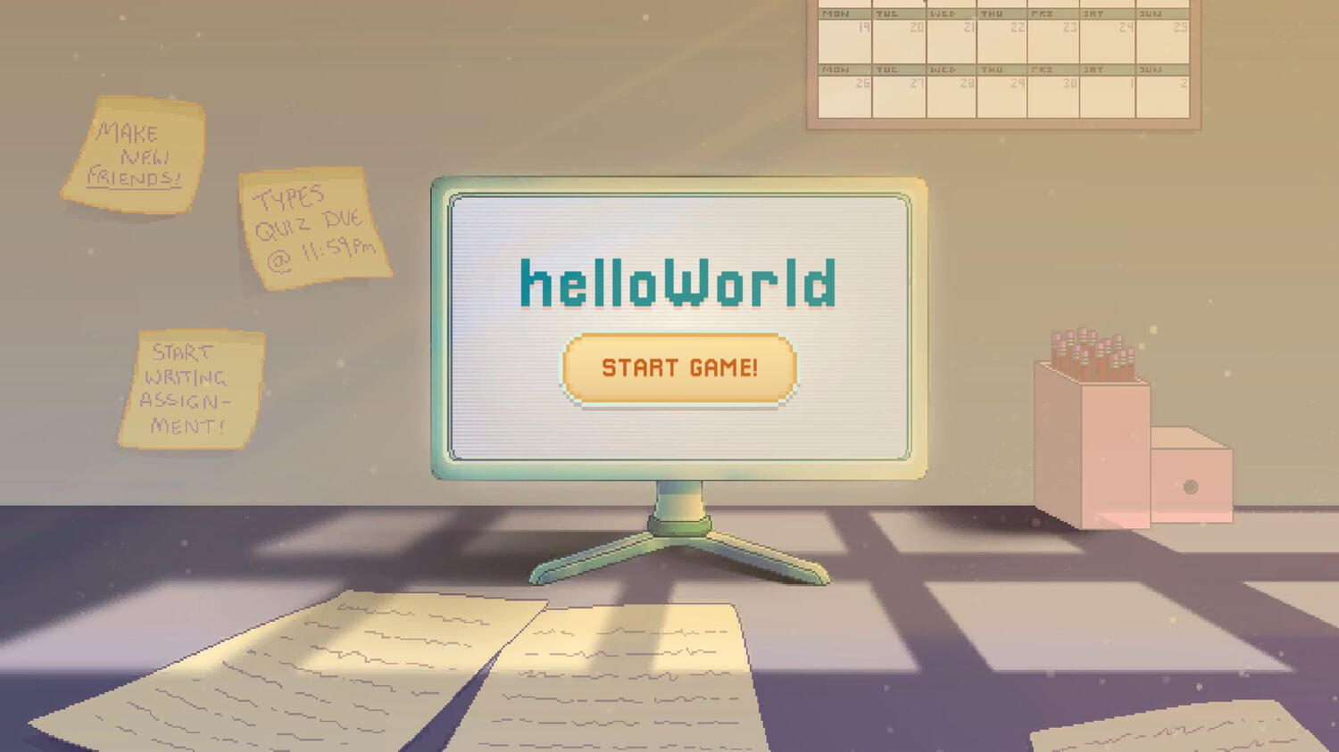
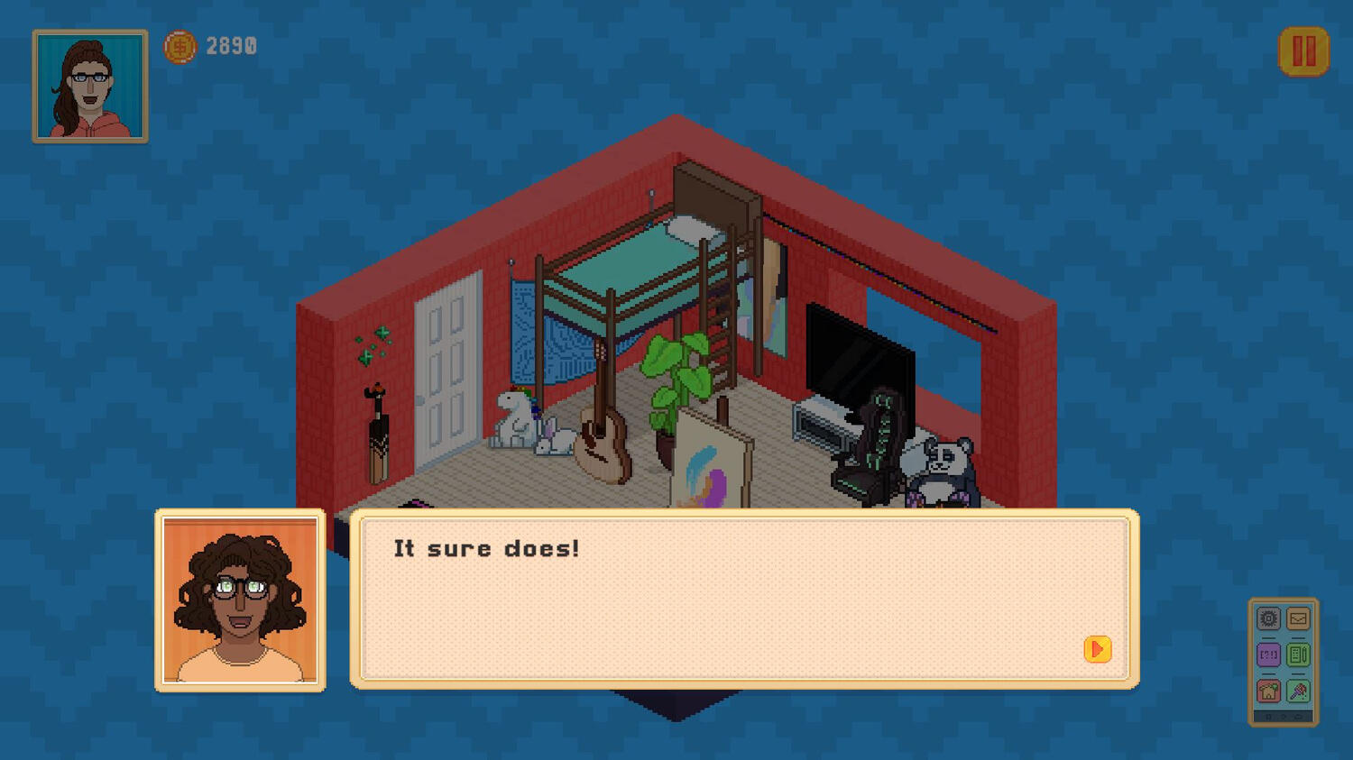
helloWorld is a cosy, room-centric simulation of O-week at the Queensland University of Technology. it was created to show future students what moving away from a regional area and into dorms near campus may look like.as part of a team of three, my role in this project was as the group's artist and sound designer.all visuals in this top-down, 2D isometric game are original pixel-based assets created by myself within the span of 13 weeks. this project ended up being a brilliant way for me to develop my abilities in the rapid creation of isometric pixel assets over the course of multiple sprints.
deciding on the art style
upon meeting the rest of my group and deciding what our general game premise was going to be, i advised my team that although i could create 3d assets, i would be able to create something of a much higher quality if we did 2d instead.after demonstrating some of my artwork, they agreed. this allowed me to majorly play to my strengths to ensure that our project had an extremely high level of polish at the conclusion of our game cycle.
quantity of work
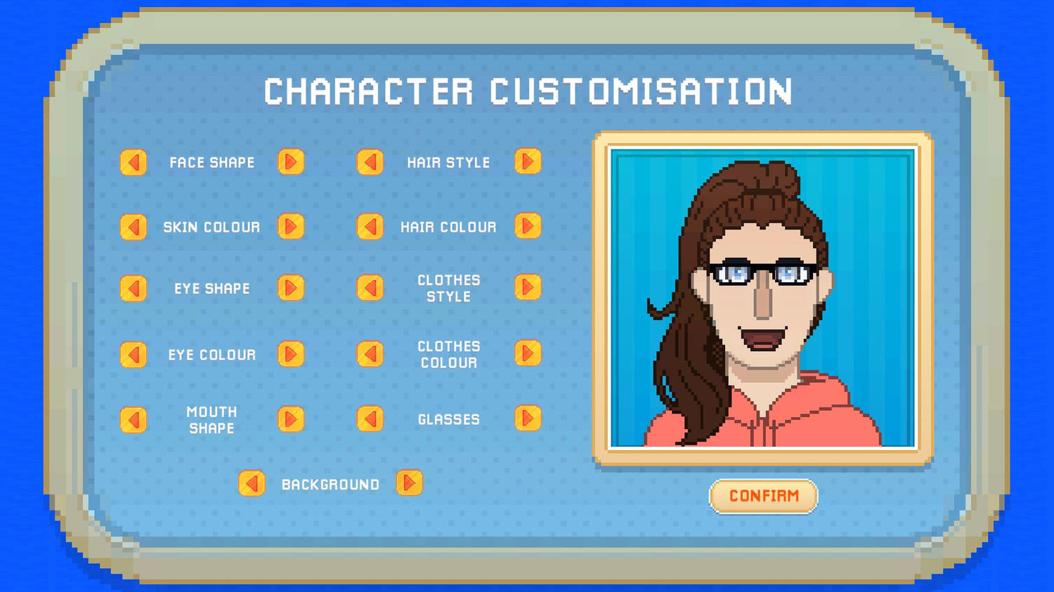
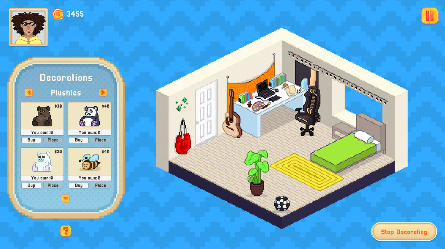
to date, this project features the largest quantity of assets i have ever created over the course of a 13-week period. this includes over 540 assets in the character customisation menu alone, over 250 room decorations, and a variety of other UI and minigame visuals.although it certainly made for a busy semester, i thrived off the challenge and am proud of how visually polished our game's final product ended up looking.
retrospective consistency
looking back on this project a few years on, one thing i find prominent now is some pixel size inconsistencies between the UI and room customisation assets.since at the time i was so focused on creating a large quantity of assets, it meant that certain visual components of our game did not receive as much attention as they deserved. in future projects, i aim to be more mindful of ensuring that the quality of the project overall receives just as much finesse as the quantity of assets it includes.
onerous.
developed by Mark Auman (lead programmer), Jessica Childs (lead artist), & Sienna Wilton (lead designer).
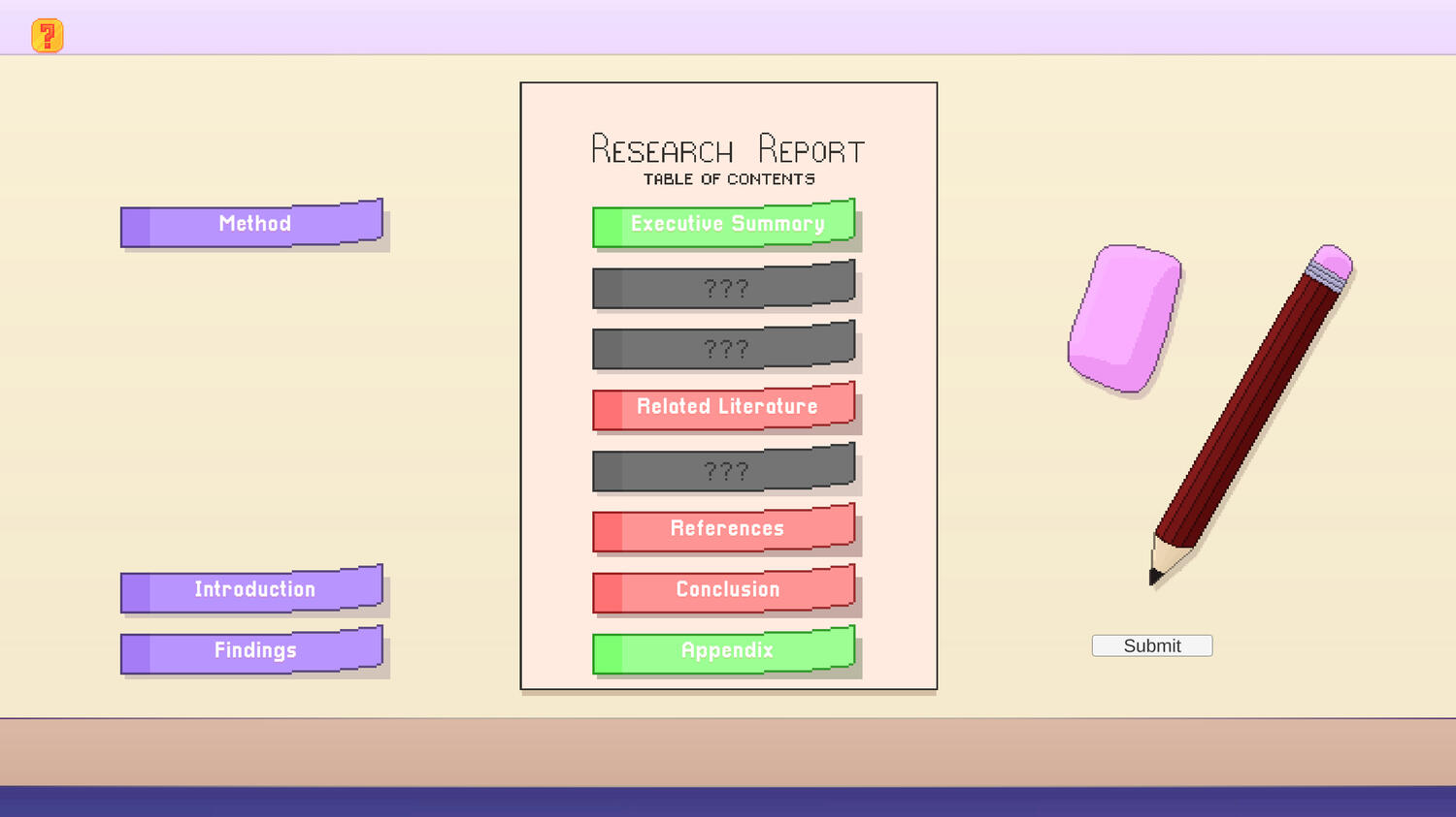
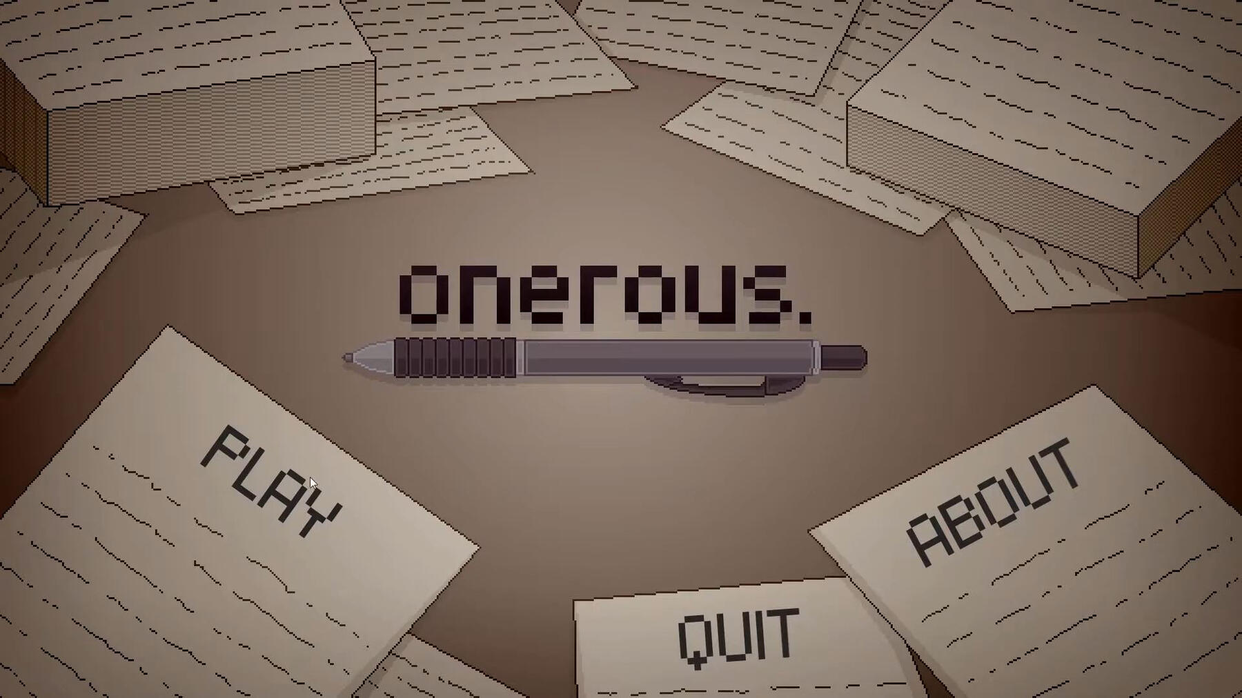
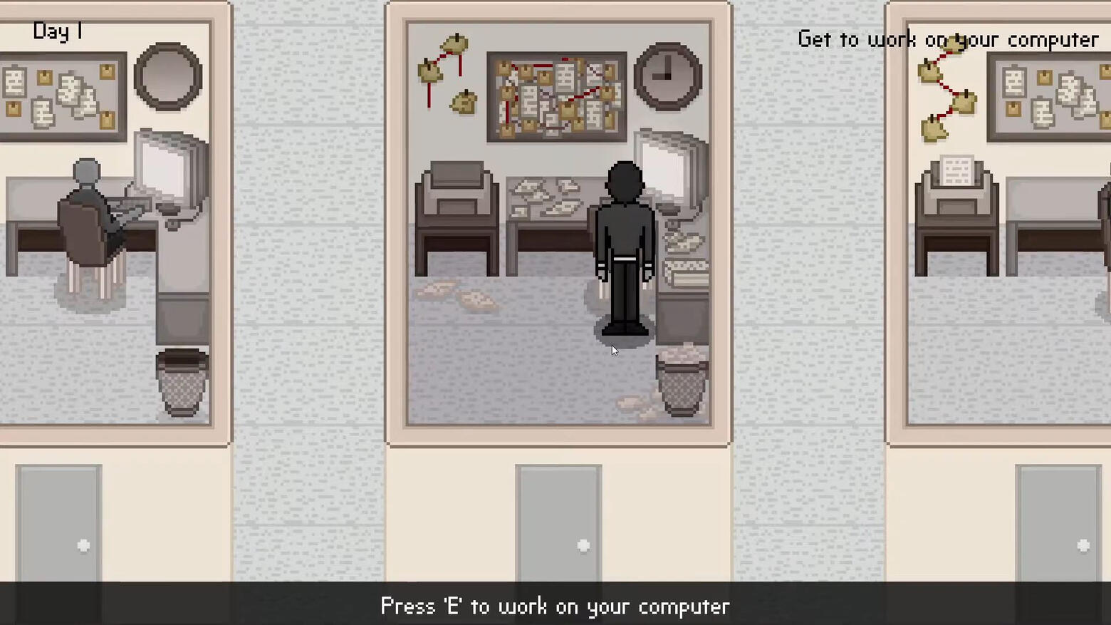
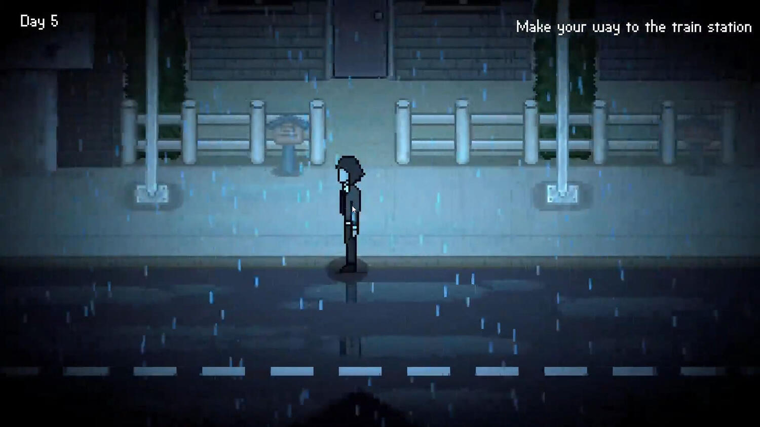
onerous. is a game about the monotony of those who consistently overwork themselves, and the mental health issues that may arise from such behaviour.as part of a team of three, my role in this project was the group's lead artist. as such, all visuals in this top-down, 2D game are original pixel-based assets created by myself within the span of six weeks.
colour symbolism
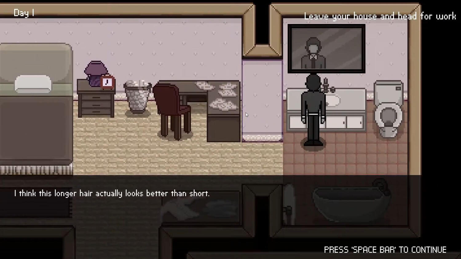
due to the nature of this game handling more serious and depressing topics, one important aspect of the visuals i created for onerous. (and discussed thoroughly with the team) was restricting the colour palette to primarily subdued and muted colours.working with these muted colours was an insightful experience, as it forced me to be a lot more selective, particular, and intentional with my artistic representations to ensure the message the game aimed to portray was being visually reinforced. at the same time, it taught me how to balance and contrast shades well against each other, as i had to ensure that i wasn't selecting colours that were too dark or too bright that might have otherwise been detrimental to the visual atmosphere of onerous.the only exception to the "muted colour rule" was when the player is confronted with "memories", which instead use a heavily saturated palette to visually contrast the monotony of the player's day-to-day life with the happier memories of their childhood. thanks to my prior focus on a muted palette, these vibrant colours were very effective in being as eye-catching and emotionally "warm" as we were hoping to convey.
top-down perspective
after forming a team with Mark and Sienna, i was quick to let them know that while i could work with 3d assets, i would be able to work a lot faster (and achieve a higher level of polish) with 2d pixel illustrations. after seeing examples of my work, they agreed to let this guide the visual style of our game.we debated between isometric and top-down briefly, but ultimately we decided that top-down pixel assets would be a lot easier for our players to control, and would contribute better towards our player's immersion.this was the first time i had generated so many top-down pixel assets in such a brief period of time, so it was quite insightful to experience the production pipeline whilst finding ways to speed up my ability to create assets quickly and efficiently. it gave me a much greater depth of knowledge surrounding the precision that good pixel art demands.
pixel tiling & sprite sheets
onerous. was my first experience creating both accurate pixel tiling and sprite sheets.due to the more modular nature in which pixel tiling works, it was imperative that the assets i created adhered to the correct canvas sizes to ensure they could be correctly and easily placed throughout the game's environments. this facet of creating the visuals for onerous. helped me become a lot more precise and mindful of how even a single pixel out of place in a 2d asset could drastically change its readability.additionally, prior to working on this game my only experience with pixel animation was exporting individual frames and combining them into .gif files. throughout my work on onerous., however, our programmer Mark helped guide me towards understanding the importance and ease of use that sprite sheets provided. it has allowed me to become more professional in my animated workflow, as it means that small changes to the pixel character's animation can be made a lot faster and more efficiently.

Second String
developed by Jessica Childs.
Second String is a written pitch for a movie of the same name. it follows two fantasy princes and their discovery of magical instruments that, when played, can summon powerful beasts to fight by their side.as the sole developer of this pitch, i was responsible for all of the worldbuilding, concept art, character design sheets, research, and writing throughout the project.
the intent behind colour
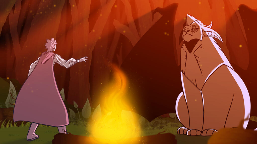
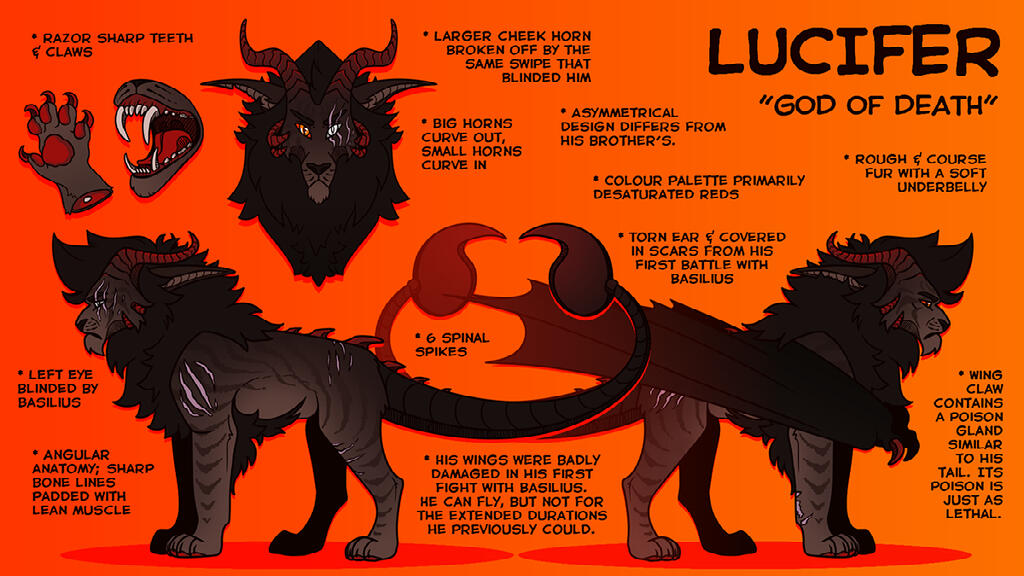
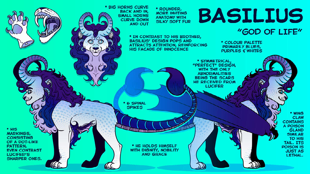
one of the most prominent visual skills i honed whilst working on Second String was the importance of colour theory and conveying atmospheric intent via precise colour usage. i utilised this knowledge both in creating the four main character's designs, and illustrating the rough thumbnails that convey key moments throughout the proposed movie.
visually effective marketing
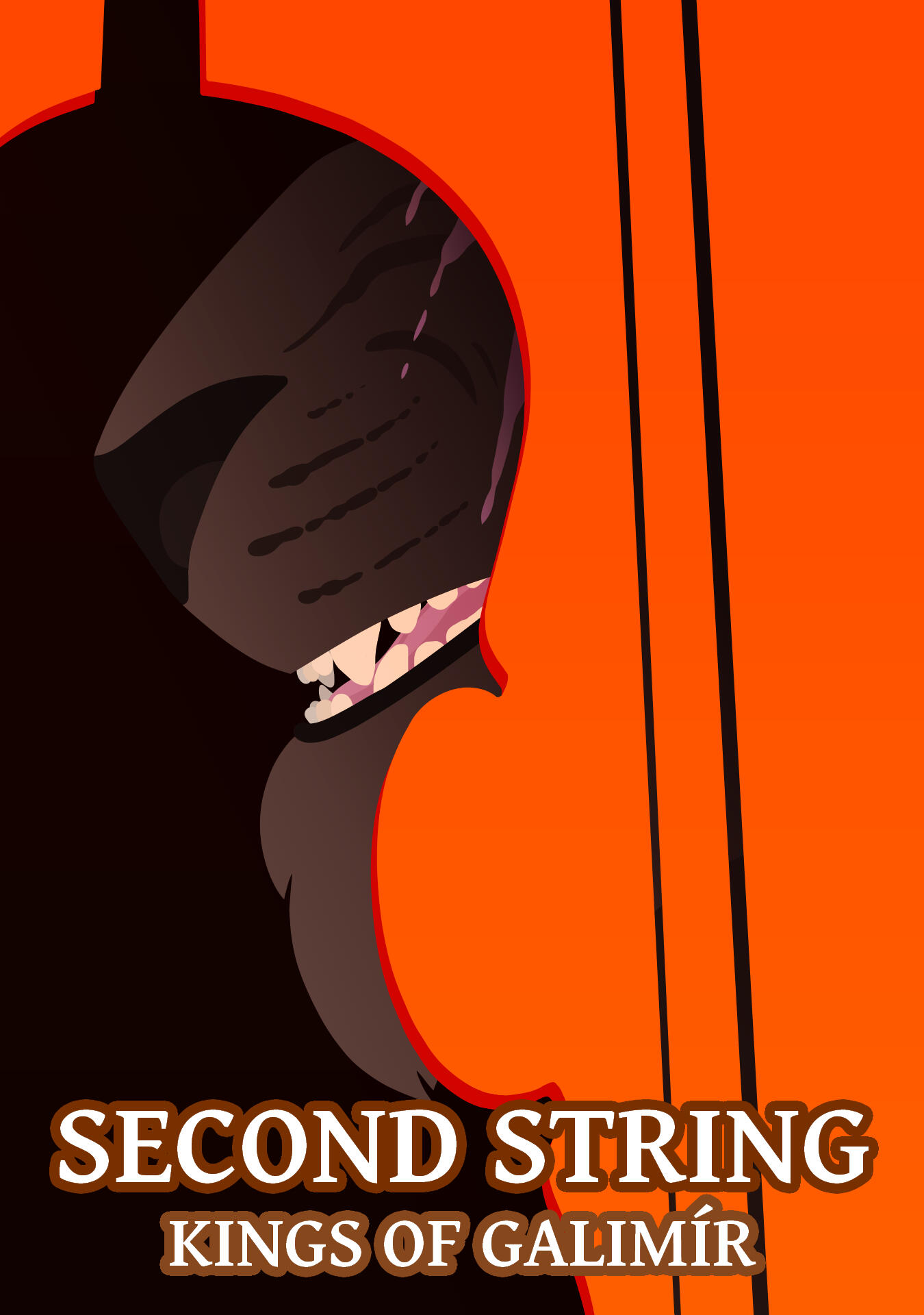
one aspect of Second String that i decided to experiment with was creating faux "promotional material" to visualise how this proposed movie would be marketed to audiences.i found this helped reinforce my attention to detail and develop my creative out-of-the-box thinking, as it required me to come up with visually striking posters that would convey the most important facets of the movie's premise whilst capturing and retaining viewer's attention. i especially enjoyed experimenting with silhouettes and layers, as can be seen in the example to the right.
the devil's in the detail
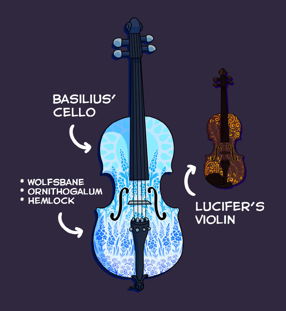
another important visual skill i honed throughout Second String's creation was the importance of tiny details in conveying the temperament and personality of characters on-screen. the most intricate example of this can be found in the decoration of Basilius' cello.given that Second String's magical instruments reflect the truth of the beasts they summon, studying the details of Basilius' cello can provide the viewer with insight into the beast's true intent before it is ever revealed on-screen.although at face value Basilius seems friendly and concerned for the welfare of the kingdom's people and the prince who wields his instrument, taking a closer look at his cello reveals depictions of wolfsbane, ornithogalum, and hemlock; three plants well-reknown for their gorgeous appearance, yet deadly nature.
Mandjet 1.0
developed by Jessica Childs (artist, character designer, graphic designer), Chris Lawson (producer, writer, quality assurance), Clayton Trewben (researcher, writer, quality assurance), Damen Thew (gameplay designer, researcher), & Jorden Reichardt (researcher, writer).
this booklet is the first of two created for an original table-top roleplaying game called Mandjet, developed by my team of five over the span of seven weeks.as the artist, character designer and graphic designer of my group, i was responsible for creating original artwork, coming up with the main and background character's appearances, and establishing the design and formatting of our table-top game booklet.
time constraints
given that we were a team of 5 and the others in my group were primarily focused on completing the written content of our booklet, it was a challenge to balance personal deadlines with the overall deadline of the finalised booklet.whilst everyone was completing their written work, i drew up a series of environmental illustrations and character/item designs that would appear throughout the book as important places, people, and objects.considering my graphic designer status in the group, i ended up becoming somewhat of a pseudo-producer to ensure the team sent their completed written work my way as soon as possible. this was so i had ample time to get everything formatted, with adequate additional time spent on revisions as needed.although i am happy with how many aspects of this booklet turned out, i believe that the time i spent working on the booklet's visuals meant somewhat of a detriment to its overall formatting. i kept this in mind when moving into my second Mandjet project, and learnt, overall, that it was important to balance both aesthetics and readability to contribute towards a quality viewing experience.
character design
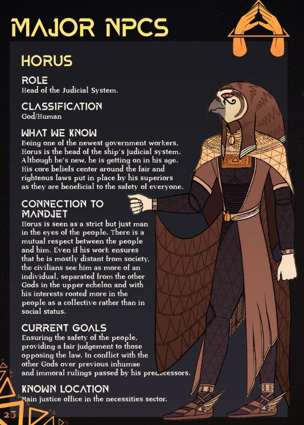
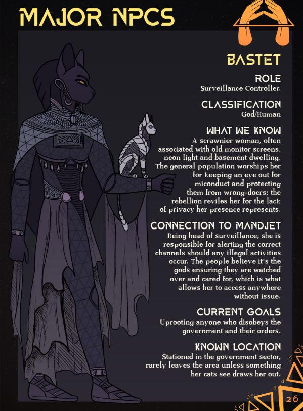
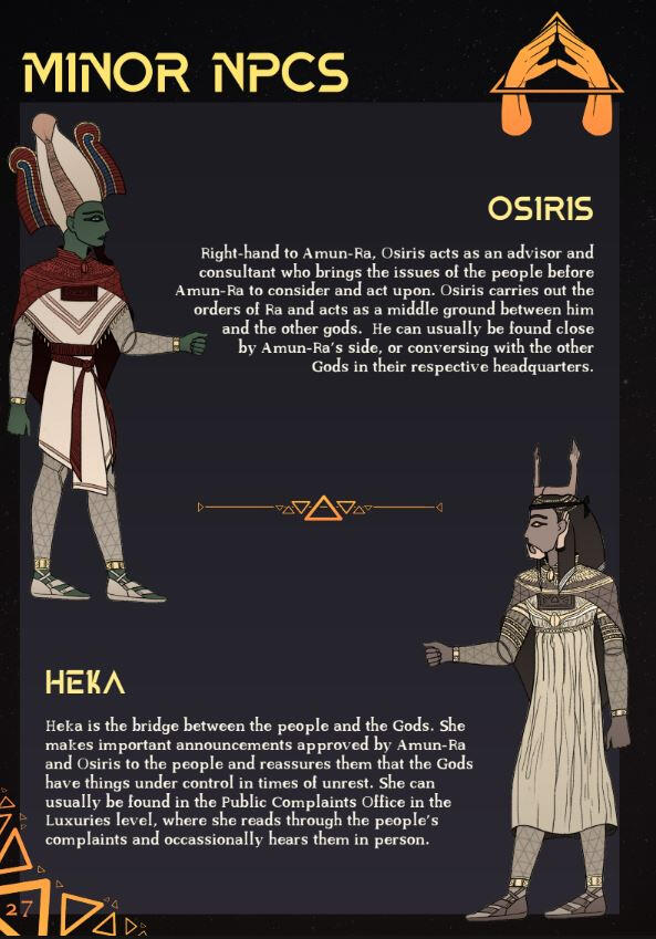
given that Mandjet combines ancient Egyptian aesthetics within a science fiction premise, it was quite fun working out how to incorporate the traditional appearance of Egyptian gods into somewhat futuristic suit designs.i ultimately ended up researching each of the gods and browsing many depictions of them to determine the most distinguishing traits that should be kept concurrent in each design. i then worked to make them look more streamlined, with colours reflecting their traditional appearance in a way that looked regal, intimidating, and somewhat "larger than life".
art style
one important visual trend i stuck with throughout the duration of creating art for our Mandjet booklet was ensuring every character was somewhat "flat" in appearance, and strictly looked left or right — never front-on. this was done to mimic the style of Egyptian hieroglyphs, and helped contribute towards our booklet's visual aesthetic (which was additionally reinforced via our primarily black and gold colour scheme).experimenting with mimicking art styles throughout this project was beneficial as it let me work out how to break down other artworks in a way that would let me copy their most prominent features. although this may not always be applicable in the projects i work on, being able to effectively incorporate my art with pre-existing artwork is an invaluable skill as it means i can match the appearance of others i may work with, on projects i may need to join part-way through. this helps with visual consistency and cohesion in team creations.

Mandjet 2.0
developed by Jessica Childs.
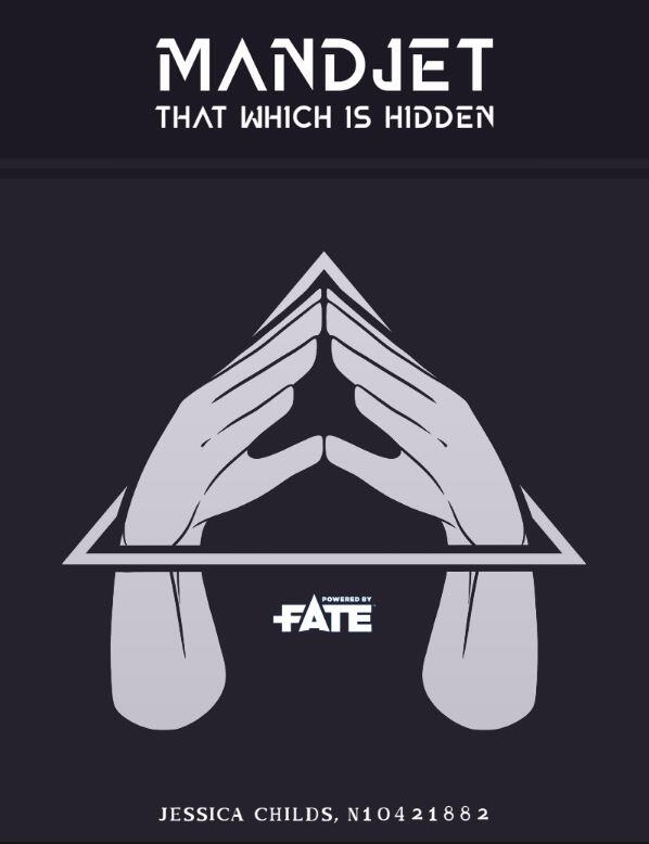
this booklet is the second of two created for an original table-top roleplaying game called Mandjet, developed by my team of five over the span of six weeks.this specific booklet features an original campaign individually created by myself based on our group's previous overarching worldbuilding. although the fundamentals of the world were established by my team in Mandjet 1.0, everything in the following booklet was individually written and created by myself.
keeping it simple
after reviewing the finalised version of Mandjet 1.0, i wasn't quite happy with how the overall formatting of the book ended up looking. that's why in this booklet, i worked on keeping things much simpler, more compact, and visually clean. ultimately, this resulted in a more succinct colour palette with less detailed visuals and slight structural changes.
colour prominence
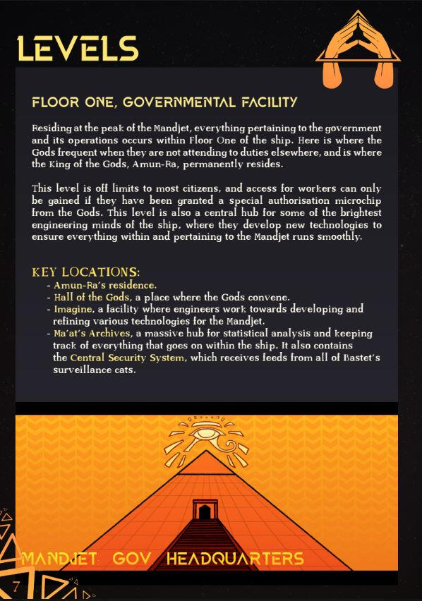
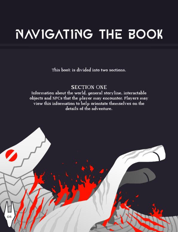
although many of the visuals in this booklet are much less visually complex than those i created for Mandjet 1.0, one visual component i tried to enhance was the striking effectiveness of using colour sparingly and only in important sections meant to draw the viewer's eye.i think this experimentation resulted in some incredibly effective visuals. it helped me develop a better eye for how more details don't always result in more visually distinct illustrations.the most obvious example of this is on page 8, as depicted to the right.
formatting
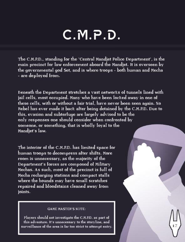
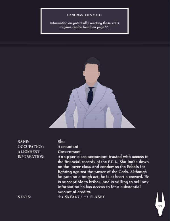
compared to Mandjet 1.0, i focused on making Mandjet 2.0 much more succint and to the point in its formatting. this meant allowing for more space between paragraphs, more compact text, and much less colour usage to ensure the booklet looked a lot more sleek and straightforward.the various images i included throughout the booklet helped give the pages character, and related to the content on the page in a way that added to the reader's visual experience.

Backseat Burnouts
developed by Watch This Space Studios, featuring the work of Jessica Childs (3d artist, level designer), Corey Rose (programmer), & Janak Tracey (producer, level designer, sound designer).
content to be added upon conclusion of the project.check back later!
an assortment of concept artworks
establishing the context
with the skills i have garnered from completing my course in QUT’s Bachelor of Business (Marketing)/Bachelor of Games & Interactive Environments (Animation) degree, i intend to apply to games development and animation-centric companies as a 2d/3d artist, graphic designer, and concept artist.examples of positions i would ideally apply for, either further along in my career or within the immediate future, include:
•ㅤ3D Art Intern at Ubisoft
•ㅤVideo Artist (Marketing) at Gameloft
•ㅤArtistic Director (Visual Design) at Ubisoft
•ㅤSenior Character Concept rtist at Blizzard Entertainment
•ㅤSenior Art Director at Blizzard Entertainment
the common artistic skills required by most/all of these positions include:
•ㅤmasterful understanding of character silhouettes, anatomy, lighting, composition, staging, and architectural/environmental design
•ㅤexperience in visual storytelling
•ㅤthe ability to effectively proceed from initial sketches to refined, complete artworks
•ㅤthe ability to create a variety of animate and inanimate characters/objects
•ㅤgood/masterful knowledge of digital art programs, such as Maya and Photoshop
skills justification
considering the requirements of my desired jobs and the fact that i’m more likely to get my foot in the door at a younger game design studio (where the team sizes are much smaller than those in larger companies), the chance of me needing to cover multiple different tasks within my role as an artist rather than specialising in one specific niche is high. as such, it makes sense to have as diverse a portfolio as possible to demonstrate to potential employers that my skill set can be adapted to suit a broad range of applications.after reflecting on my current portfolio, i think it’s relatively clear that i already have quite a polished 2d pixel skill set (as seen in helloWorld and onerous.). by the time this semester is complete, i will have also finished a huge number of 3d assets for my IGB301 team’s game, Backseat Burnouts. additionally, i’ve demonstrated capability in character design, reference sheet creation, and graphic design work in my Second String, Mandjet 1.0, and Mandjet 2.0 projects.with all these different capabilities already effectively displayed in my portfolio, i believe that further diversifying my work into dynamic 2d, non-pixel promotional drafts and concept artworks would be the most beneficial type of project for me to pursue.
personal justification
for as long as i have been creating digital artworks, capturing high levels of energy and a sense of weight/movement in my 2d illustrations has been somewhat of a challenge for me. on top of this, i haven’t had much time to brush up on my anatomy or composition skills within a strictly 2d medium in quite a while.although some of this style of content can be seen in Second String, the unit in which i completed this project was a number of years ago now, and the artwork showcased throughout is underdeveloped compared to how most concept art in a professional setting would look. for this reason, it would make sense for me to create a series of more high quality artworks that showcase my current level of ability, and demonstrate my understanding of various techniques such as colour theory, dynamic posing, perspective, cinematic composition, lighting, staging, and conveying narrative via a visual format.
project overview & outocmes
my plan for this project is to complete a series of concept artworks and promotional content drafts (such as movie posters) to demonstrate my ability in effectively composing scenes, utilising colour theory, and illustrating key moments in cinematic cutscenes/animated scenarios.seeing as QUT expects 12 hours per week to be put into each subject, i plan on completing two concept artworks per week that take, on average, 6 hours each. i believe this is an apt amount of time to spend per artwork, as it allows me to make each piece relatively refined whilst maintaining a fast-paced consistency that simultaneously demonstrates my ability to work to pre-defined schedules.since rapid content generation is a necessary (and expected) skill required throughout the pre-production phase of developing video games, movies, animated series, and various other projects within the entertainment industry, working on a project that demonstrates this ability within my current portfolio will help “fill the gaps” in my current 2d/3d skill set. it will also showcase to potential employers that i am able to work fast to meet deadlines, and that i am capable of illustrating various subject matter — which makes my skills appear highly adaptable and suitable for a variety of artistic applications.an additional benefit of pursuing this specific style of project is that, over the years, i have spent a great deal of time coming up with many original story ideas and characters. this makes completing this task a lot easier, as i already have an enormous range of pre-existing ideas and scenarios to draw upon and create illustrations of. due to this, i do not have to spend a significant amount of time at the start of this project worldbuilding from the ground up. instead, i can jump straight into illustration, which in turn allows me to maximise the number of concept artworks i am capable of creating throughout the remainder of this semester.some scenarios i will likely illustrate to demonstrate as much of my 2d capabilities as possible include:
•ㅤa fight between a man and beast in a city alley at night (demonstrates effective understanding of lighting, bounce lighting, shading, dynamic poses, and composition within a confined space)
•ㅤa flying pirate ship floating next to a skyscraper at dusk, as seen from the ground (demonstrates effective use of perspective, sense of scale, and reflections in windows)
•ㅤgraffiti artists spray painting a large mural onto a brick wall at night (demonstrates effective use of vibrant colours at night, sense of scale, and the effect of minimal lighting in a large open-air space)
•ㅤa hooded figure exchanging gold items for cash in a second hand buy-and-sell store (demonstrates capability to illustrate interiors, metal and reflective surfaces, and effective scene composition)
•ㅤthree armchairs facing a client on a sofa. Two of the armchairs are occupied by men in detective-like clothes; the third is very obviously left empty (demonstrates my ability to convey a sense of story through contextual environmental clues)


